I decided to use Photoshop to create my final poster. I chose this because it meant that I could develop my skills learned in the digital media workshop. Using Photoshop also meant that I could quickly make small changes, such as colour, font, size etc, which really helped me when developing my final poster.


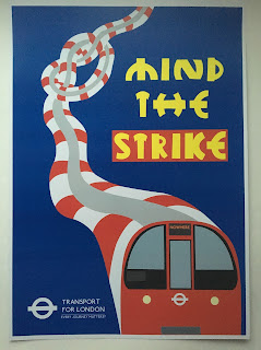
I am quite happy with my final poster. I took inspiration from TFL posters, which use bold shapes and colours. In one of my variations, I used a very similar font to the Johnston font used by TFL, in an attempt to make my poster look like a TFL poster. However if you look closely, you can see subtle differences, such as a question mark on the end of TFL's slogan (Every Journey Matters), and the train destination is 'nowhere'. In my other variation, I used the font that I produced during and after the typography workshop. I used the London Underground logo to draw around, creating each letter from the iconic shape. I also took inspiration from the 'I Want Out' poster I analysed earlier in the project. This poster used colour and outline to highlight and emphasise the one word that has been changed in the original 'I Want You' poster. I changed 'Mind the Gap' to 'Mind the Strike'. In my second poster, I used a red box around the word I changed to emphasise it. To improve my poster, I could work into my font further, as I am still not sure whether it is effective enough.


I am quite happy with my final poster. I took inspiration from TFL posters, which use bold shapes and colours. In one of my variations, I used a very similar font to the Johnston font used by TFL, in an attempt to make my poster look like a TFL poster. However if you look closely, you can see subtle differences, such as a question mark on the end of TFL's slogan (Every Journey Matters), and the train destination is 'nowhere'. In my other variation, I used the font that I produced during and after the typography workshop. I used the London Underground logo to draw around, creating each letter from the iconic shape. I also took inspiration from the 'I Want Out' poster I analysed earlier in the project. This poster used colour and outline to highlight and emphasise the one word that has been changed in the original 'I Want You' poster. I changed 'Mind the Gap' to 'Mind the Strike'. In my second poster, I used a red box around the word I changed to emphasise it. To improve my poster, I could work into my font further, as I am still not sure whether it is effective enough.
Comments
Post a Comment